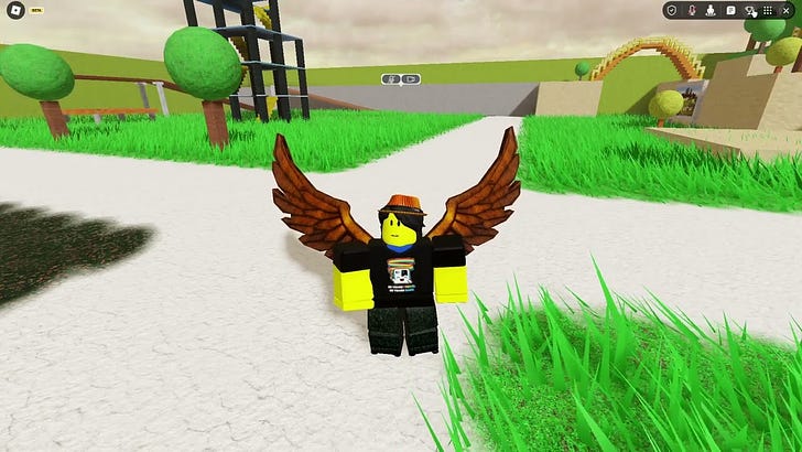
New Roblox menu "Chrome" to enter beta testing
More parts of the Roblox user interface are being revamped for the Roblox of today
Roblox may soon allow developers to try out the new Chrome top bar to test integration opportunities in games, as seen in new translation strings released today.
The buttons in the new Chrome menu are circular in nature, with a Roblox menu button, as well as a slide over menu activated by clicking a block symbol. Here, players will be able to find the toggles for text chat, the leaderboard and the emotes menu as with the previous iteration of the menu. Added to this menu is a button to quickly report the experience or another player, a dedicated button for voice chat and a “window”, which merely allows the user to resize the window between two sizes (this is currently unreleased, hence some features may not be working currently), as well as an overflow menu containing the items which were in the old menu.
According to these new translation strings, there will also be API to allow developers to customise the placement of these new menu interfaces, to allow for better integration within the experience. At this time however, there is currently no information on what this may entail in terms of customisability.
The video below demonstrates the menu in action:
UPDATE 29th Aug 2023: This feature is now available as a beta feature and will be released soon under Updated Experience Controls
All features of the new topbar “Chrome” discussed in this article were unreleased at the time of publication and may be modified or removed without notice. Explorers of the Metaverse is not liable for any damages or injuries which may result as of enabling these features yourself and is not able to guarantee the release of the unreleased features.


